
Museum Signage quietly shapes how visitors enter, move, pause, and understand a collection. A sign can point toward the galleries, clarify a confusing junction, or make a small object feel worth noticing. The best choice is not simply the most attractive panel. It is the system that serves real visitors in real spaces.
Museum interpretation pioneer Freeman Tilden wrote, “Through interpretation, understanding; through understanding, appreciation; through appreciation, protection.” His words offer a useful test for Museum Signage: does each message help people connect with what they see? A family near a crowded entrance may need a clear directional arrow, not a dense paragraph. A visitor studying a delicate textile may benefit from concise context, readable type, and glare-free placement. Small details matter.
This guide explores how to match signs to your facility’s architecture, audience, collections, and daily operations. It considers wayfinding, interpretive labels, accessibility, materials, typography, placement, and maintenance. It also asks practical questions: Can visitors read a label without blocking a doorway? Will sunlight wash out the text at noon? Can staff update a temporary exhibition without replacing an entire panel?
No system works everywhere. A polished sign cannot fix a confusing floor plan, and more information is not always better. Sometimes, the right answer is less text. Sometimes, a sign still misses the mark. The aim is to choose Museum Signage that feels clear, durable, welcoming, and honest about what visitors need. Testing signs with actual visitors can reveal problems that design reviews overlook. Start there.
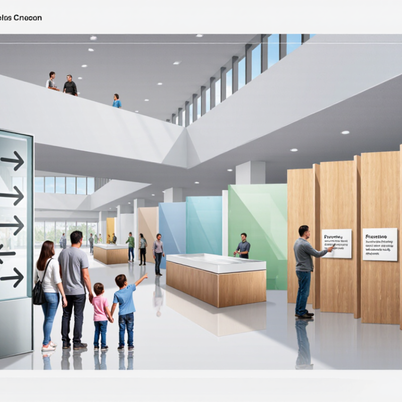
Map the visitor journey before choosing signs: entrance, ticket desk, galleries, restrooms, and exits. A family with a stroller needs clear, readable directions; a researcher may need precise object labels. Different jobs. The American Alliance of Museums’ 2021 Museums and Trust study found that 96% of Americans view museums as trustworthy information sources. That trust raises the stakes: vague arrows or dense labels can weaken an otherwise thoughtful visit. Check sightlines, lighting, noise, and stopping space in each area.
Define the goal of every sign: orient, interpret, reassure, or prompt action. The World Health Organization’s 2022 Global Report on Health Equity for Persons with Disabilities estimates that 1.3 billion people worldwide experience significant disability. Plan for seated reading, high contrast, plain language, and tactile or audio alternatives where suitable. Small trials matter. Ask visitors to find a gallery, understand one label, and locate an exit without coaching. Record hesitation points; they reveal gaps that floor plans miss. Some assumptions will fail. Recheck signs after exhibitions change, because a helpful route can become a dead end.
Choose signage by tracing the visitor journey, from the entrance to the final gallery. At the approach, exterior signs should identify the museum and make the entrance easy to spot. Near the door, welcome signs can show opening information, ticket points, and a simple floor map. Keep key directions visible before visitors reach a confusing junction.
Inside, use directional signs to connect galleries, stairs, lifts, restrooms, and exits. In exhibition spaces, interpretive signs should add context without competing with the objects. Place labels where visitors can read them without blocking circulation. Check sightlines from a child’s height and from a seated position. A sign that looks clear on a plan may disappear behind a queue or catch glare from a window. Even a tidy system can miss these small, real-world obstacles.
Tips: Walk the route as a first-time visitor. Notice where you pause, turn, or ask for help. Use consistent wording and symbols, and test sign placement under typical lighting. Keep messages brief; visitors rarely stop for a paragraph of directions.
| Visitor Journey Stage | Visitor Need or Question | Recommended Sign Types | Typical Placement | Useful Content and Design Considerations |
|---|---|---|---|---|
| Approaching the museum | Where is the entrance, and is the facility open? | Exterior identification sign; entrance sign; hours and admission information sign | Visible from the approach route, near the public entrance, and at the point where visitors choose an entrance | Use clear wording, strong contrast, and readable lettering at the expected viewing distance. Include current opening hours and a clear indication of the public entrance. |
| Arriving and entering | Where should I go first, and what services are available? | Welcome sign; orientation directory; information-desk sign; service signs for restrooms, cloakroom, and lifts | Just inside the entrance and at the main reception or information point | Show the overall layout and key visitor services. Use familiar words and consistent symbols, and keep the first set of directions easy to scan. |
| Buying or validating admission | Where do I buy or check tickets, and what are the entry conditions? | Ticketing sign; queue-direction sign; admission and visitor-policy sign | Before the ticket queue, at ticket counters or self-service machines, and at the point of entry | Make queue routes and payment or ticket-validation steps explicit. Present essential rules in concise language and make any access or concession information easy to find. |
| Choosing a route | How do I reach a gallery, facility, or exit? | Directional signs; floor directories; stair and lift signs; exit signs | At intersections, gallery entrances, changes of floor, and other decision points | Give directions before visitors reach the decision point. Use consistent names for destinations and keep arrows, colors, and symbols consistent throughout the building. |
| Entering a gallery | What is this gallery about, and where should I begin? | Gallery identification sign; introductory or orientation panel; gallery map where useful | At the gallery threshold or another unobstructed point visible on entry | State the gallery topic and, where relevant, suggest a starting point or route. Keep introductory text concise so visitors can orient themselves without blocking circulation. |
| Viewing an object or exhibit | What am I looking at, and why is it significant? | Object label; interpretive panel; media or interactive instruction sign | Adjacent to the object or exhibit, positioned for comfortable reading without obstructing views or access | Use a clear hierarchy for the object name, essential facts, and interpretation. Provide sufficient contrast and legible text, and ensure labels can be read from an accessible position. |
| Finding accessible routes and facilities | Is there a step-free route, lift, accessible restroom, or seating area? | Accessible-route signs; lift and restroom signs; seating-area signs; tactile or braille signs where appropriate | At route choices, facility entrances, lift landings, and locations where visitors may need to change direction | Use clear, consistent accessibility symbols and identify step-free alternatives where routes differ. Place signs where they can be seen and reached without creating obstacles. |
| Using visitor amenities | Where can I find the café, shop, water, cloakroom, or restrooms? | Amenity identification signs; directional signs; operating-hours or service-information signs | At amenity entrances and along the routes leading to them | Use recognizable wording or symbols and show directions from the main visitor route. Update temporary service information when hours or availability change. |
| Responding to temporary changes | Is a gallery closed, a route changed, or an event taking place? | Temporary closure sign; detour sign; event sign; temporary directional sign | Before the affected route or entrance, with additional signs at relevant turning points | State the change, its effective period when known, and the next best route or alternative. Make temporary signs visually consistent with the permanent sign system. |
| Leaving the museum | Where is the exit, and how do I return to the entrance or transport links? | Exit signs; directional signs to the entrance, parking, or transport; final visitor-information sign | Along exit routes, at route junctions, and near the entrance or visitor-services area | Keep exit directions clear and consistent with the building layout. Distinguish ordinary visitor directions from emergency exit signage, which must follow applicable safety requirements. |
Museum signage works best when its materials suit the room, not just the design board. In a bright entrance, matte panels reduce glare from glass doors and overhead lights. In a hands-on gallery, durable, wipeable surfaces handle frequent cleaning better than delicate paper finishes. Still, “durable” does not mean indestructible; edges and fixings need regular checks.
Choose formats around how visitors move. Wall panels can carry longer explanations, while freestanding signs help at junctions or temporary exhibits. Small labels work beside objects, but cramped type can make careful interpretation tiring. Test a sample at the actual viewing distance. A label that looks readable on a laptop may disappear beside a dim display case. It happens.
Visual style should support the collection without competing with it. Use clear contrast, consistent heading sizes, and enough empty space for visitors to pause. A restrained palette often suits historic interiors, while brighter accents can guide families through busy learning areas. But consistency can become rigid. Some galleries need quieter signs; others need a stronger visual cue. Ask staff where visitors hesitate, then adjust the placement and wording. A short visitor test can reveal problems that a polished proof will not.
Museum signs must work for visitors who cannot rely on small print, color, or spoken directions. The World Health Organization’s 2022 Global report on health equity for persons with disabilities estimates that 1.3 billion people experience significant disability. That makes accessible wayfinding a core design task, not an optional extra. Use readable type, strong contrast, plain wording, and consistent symbols. Place tactile characters and Braille at room entrances where required by local standards. Small details matter. A glossy panel may reflect ceiling lights; test it from a seated position and under actual gallery lighting.
Safety signs need the same care. NFPA’s U.S. Fire Loss 2021 report estimated that fire departments responded to about 1.35 million fires in the United States that year. Keep exit routes and emergency instructions visible, unobstructed, and distinct from exhibit graphics. Check that temporary displays, queue barriers, or a crowded coat area cannot hide them. Keep paths clear. Requirements differ by location, so confirm sign height, tactile details, and emergency lighting with qualified accessibility and fire-safety professionals. A walkthrough with visitors can expose problems that a plan misses. It may also reveal an awkward truth: the sign is compliant, but still hard to understand.
Installation planning should begin with a walk through the facility during normal visitor hours. Note decision points, doorways, glare from windows, and places where people naturally pause. A sign that looks clear on a screen may be hard to read from a wheelchair or across a crowded lobby. Check viewing distance, lighting, mounting surfaces, and access for future repairs. Temporary paper mockups can reveal awkward placement before anything is installed. Small details matter. Even a careful plan can miss something: a sign that works in an empty gallery may disappear behind a school group.
Before installation, confirm who will approve wording, verify measurements, and record each sign’s location. Keep spare mounting materials and digital copies of approved artwork in an accessible maintenance file. During routine inspections, look for peeling edges, fading, loose fasteners, and changes in nearby displays that block sightlines. Clean signs with materials suited to their finish; harsh products can cloud or scratch surfaces. Set a review schedule, but allow staff to report problems between checks. Ask visitors where they hesitated or missed a direction, and observe busy routes without interrupting them. A short survey may help, though answers can be incomplete. Use feedback and inspection notes to adjust placement, wording, or contrast over time.
Plan installation, maintenance, and ongoing evaluation
How to read this chart: Example facility audit scores on a 1–5 scale, where 1 means “needs significant improvement” and 5 means “fully in place.” Use a local audit and visitor feedback to set and update your facility’s actual scores.
Map the visitor journey from the entrance to the exits. Check lighting, sightlines, noise, and places where people stop.
Families may need clear routes for strollers, while researchers may need precise object labels. One sign cannot do every job.
Use exterior signs to identify the entrance, welcome signs near the door, and directional signs at confusing junctions. Add interpretive labels beside exhibits.
Choose readable type, strong contrast, plain language, and consistent symbols. Keep directions brief. Small details matter.
Place labels where visitors can read without blocking the path. Check whether queues, window glare, or display cases hide them.
Ask visitors to find a gallery, understand a label, and locate an exit without help. Watch for hesitation. It can be revealing.
Consider seated reading, tactile characters, Braille, and audio alternatives where suitable. Confirm local requirements with qualified professionals.
Keep exit routes and emergency instructions clear of displays, barriers, and crowded coat areas. Walk the route under real gallery conditions.
A new display can block a sign or change a route. Even a tidy map can mislead visitors a little. Recheck it.
Choosing the best Museum Signage begins with understanding the facility’s spaces, audiences, and visitor goals. Consider how people move through entrances, galleries, exhibits, and shared areas, then identify the signs that will help them navigate, find essential information, and engage with the experience. Different points in the visitor journey may call for directional, interpretive, identification, or safety signs.
Next, select materials, formats, and visual styles that suit each setting and remain clear and easy to use. Make accessibility and safety requirements part of the planning process, including readable text, suitable placement, and visibility. Before installation, consider how signs will be mounted and maintained, and plan to review their condition and effectiveness over time. Gathering visitor feedback and observing how people use the signs can help the facility make practical improvements as needs change.